Matriarch
1 like


I notice a lot of professional pubs still specify good old Times New Roman. It is a boring but readable and reliable serif font. And does not cause issues with ambiguity like the one posted above me. 🤣
Nothing new on here, but my entry in the StoriesSpace "Not What It Looks Like" comp is now up.

And finally one where the font isn't really responsible, but that design choice though!


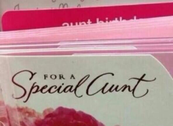
Quote by TheMonster
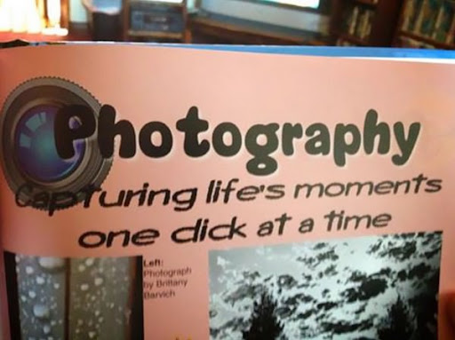
And finally one where the font isn't really responsible, but that design choice though!
Now one must wonder did they do this on purpose. Or is my mind just in the gutter 24/7